이벤트 발생 시 알림 혹은 확인 창 띄우는 alert
웹을 사용하다보면 사용자에게 확인이 필요한 경우 많이 사용하는 알림의 경우 alert를 많이 사용하는데,
오늘은 기본적인 AlertStrap과 이를 더 예쁘게 보이도록 하는 SweetAlert(Swal)을 이야기 하고자 한다
[AlertStrap.js]
import {Alert, UncontrolledAlert} from 'reactstrap';
function AlertStrap(){
return(
<>
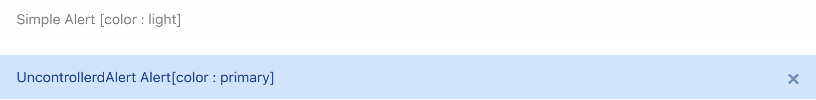
<Alert color='light'> // (1)
Simple Alert [color : light]
</Alert>
<UncontrolledAlert color="primary"> // (2)
UncontrollerdAlert Alert[color : primary]
</UncontrolledAlert>
</>
)
}
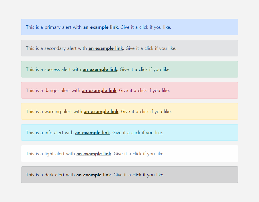
export default AlertStrap;- Reactstrap의 alert의 경우 html/css에서 사용하는 alert 창과 유사하지 않는데, 위의 Alert(1)는 아래와 같음
(2) UncontrolledAlert는 위에서 x 버튼이 추가된 것
위와 같은 alert 창은 잘 사용하지 않는데, 우리가 주로 사용하는 alert 창은 SweetAlert(Swal)이다
- swal은 reactstrap을 이용하지 않고 모듈 설치가 필요하기 때문에 아래의 명령어로 설치 후 임폴트를 통해 사용 가능
npm install --save sweetalert2

import swal from 'sweetalert2';
[Sweetalert2Basic.js]
기본적인 Swal 사용은 아래와 동일함
import {Button} from 'reactstrap';
import Swal from 'sweetalert2';

function Sweetalert2Basic(){
    const confirm = () =>{
        Swal.fire("삭제").then(result=>{ // (2)
            console.log(result.value)
        });
    }

    return (
        <div>
            <Button onClick={confirm}>확인</Button> // (1)
        </div>
    )
}

export default Sweetalert2Basic;
(1) Swal이나 Alert의 경우 확인을 위해 쓰이는 경우가 대부분이기 때문에 위는 버튼 클릭 시 Swal을 띄우도록 설정
(2) Swal.fire을 통해 Swal 창을 띄우며, Swal.fire('메시지').then('결과 로직') 과 같은 형태를 가짐
[SweetalertPosition.js]
Swal 창은 자신이 위치 설정, 시간 설정 등 다양한 옵션들이 존재
import {Button} from 'reactstrap';
import Swal from 'sweetalert2';

function SweetalertPosition(){
    const openAlert = (flag, position) =>{
        {
        Swal.fire({
            position:position, // (1)
            icon : 'success', // (2)
            title:flag+'되었습니다', // (3)
            showConfirmButton:false, // (4)
            timer:1500 // (5)
        })
    }

    return(
        <div>
            <Button onClick={() => openAlert('저장', 'center')}> 저장 </Button>
            <Button onClick={() => openAlert('취소', 'bottom-end')}> 취소 </Button>
        </div>
    )
}

export default SweetalertPosition;
(1) positon : 위치 지정
(2) icon : alert 창이 뜰 때 나오는 아이콘 ('success', 'question', 'warning' 등 다양한 아이콘 존재)
(3) title : alert의 제목(큰 글씨)
(4) showCormButton : 버튼이 보이지 않도록 설정 (기본적으로 버튼 1개가 존재)
(5) timer : alert 창 띄우는 시간
[SweetalertConfirm.js]
기본적으로 Swal 창에는 확인을 위한 버튼 1개만 존재하지만, 확인/취소를 위한 버튼 생성이 가능
import Swal from 'sweetalert2';
import {Button} from 'reactstrap';

function SweetalertConfirm(){
    const deleteAlert = () =>{
        Swal.fire({
            title : '정말 삭제하시겠습니까?',
            icon : 'question',
            showCancelButton : true, // (1)
            confirmButtonColor : '#444444', // (2)
            cancelButtonColor : "#888888", //(3)
            confirmButtonText : '예', // (4)
            cancelButtonText : '아니요' // (5)
        }).then((res)=>{
        // (6)
            if(res.value){
                document.getElementById("deleteId").remove();
                Swal.fire('Deleted', '삭제 완료', 'succedss') // (7)
            }
        })
    }
    return(
        <div>
            <h1 id="deleteId"> 삭제 대상 </h1>
            <Button onClick={deleteAlert}> 츼소 </Button>
        </div>
    )
}

export default SweetalertConfirm;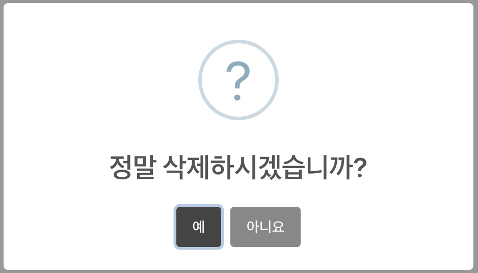
(1) showCancelButton : 기본적으로 확인 버튼만 존재해, cancel 버튼의 경우 false가 default 값이기 때문에 보이기 위한 설정 필요
(2) confirmButtonColor : 확인 버튼 색 지정
(3) cancelButtonColor : 취소 버튼 색 지정
(4) confirmButtonText : 확인 버튼 글씨 변경 (default : OK)
(5) cancelButtonText : 취소 버튼 글씨 변경
(6) 확인/취소에 대한 결과값을 then((result) =>{})로 받아 결과에 대한 코드 추가 가능
(7) Swal창의 버튼을 통한 Swal창 띄우기도 가능
'공부 자료 > 리액트[React]' 카테고리의 다른 글
| [React] 이미지, 글씨 슬라이드 / Carouselstrap (0) | 2023.10.27 |
|---|---|
| [React] 카드 / Cardstrap (0) | 2023.10.27 |
| [React] 드롭다운 / DropdownStrap (0) | 2023.10.26 |
| [React] 네비게이션 / BreadCrumbStrap (0) | 2023.10.26 |
| [React] 버튼 기능 / Badge, ButtonStrap, ButtonGroupStrap (0) | 2023.10.26 |

